
Monday, September 7, 2009


Friday, September 4, 2009


start.
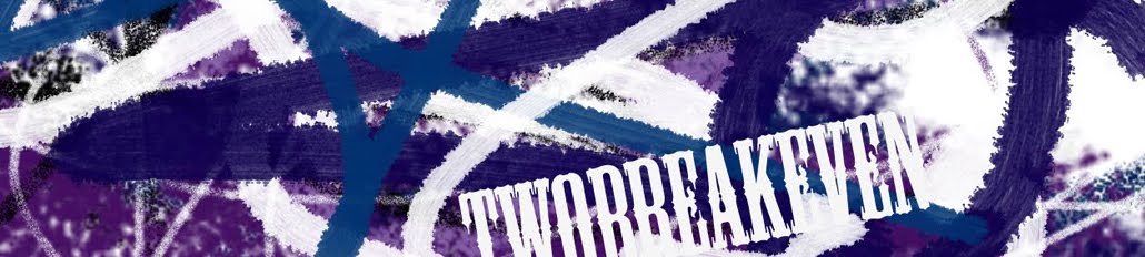
I'm trying to come up with a logo for my future business. This is what I am leaning toward (although it's a bit sketchy & the edges need to be cleaned up a bit).
The name TWOBREAKEVEN was inspired by an old bon jovi song called hearts breakin' even. Initially, I wanted the name breakeven but it was already taken (I think there is a band called breakeven). The two was added because the song was about two hearts breaking even (plus two is my favorite number). I liked the idea of two hearts breaking even. When I think about it, it isn't about a broken or shattered heart. I was about a clean break & I think that can apply to a bunch of things. When creating this logo, I thought about splitting a heart evenly & going in opposite directions. I also wanted to play with the letter t, b, & e. I'm liking this logo because I can see it on clothing, stickers, posters, etc. There also a lot of axis I can play around with.
I know that the business I'm hoping to someday have may be way into the future. Hopefully this blog will jog my creativity. This is the START.
Subscribe to:
Posts (Atom)
![coming soon [on etsy]](http://2.bp.blogspot.com/_6EVuGOjVVh0/TFdUQ7V5ZDI/AAAAAAAAAMI/cYoQeNbVCUA/S187/chelleandjenn.jpg)